



.
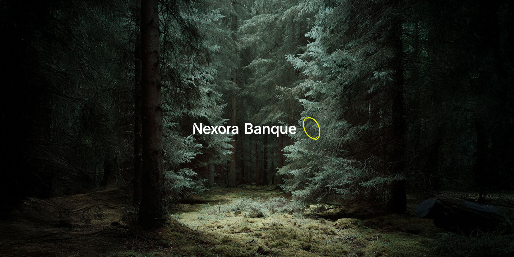
For Nexora Banque, being online means being dedicated to responsible, long-term investment.
We developed a visual identity that is both bold and reassuring, featuring a system based on a striking contrast between deep black and midnight green or electric yellow.
It is a vibrant palette that combines bold, energetic tones with understated hues.
The logo, featuring a Möbius loop, evokes growth, precision, and vision.
Three values at the heart of the Nexora promise.
The wide, generously spaced sans-serif typeface ensures immediate readability and conveys natural authority.
Digital platforms (website, app, product cards) employ a consistent geometric visual language, in which each graphic element represents a specific type of asset: water, energy, or clean mobility.
Abstraction transforms into storytelling. It is an identity that seeks to reassure through tradition and clarity.
For Nexora Bank, I led the art direction for a digital identity centered on responsible investment: a debit card made from recycled material featuring eco-engraved numbering, and eco-designed, highly legible in-app visuals.
The visual system relies on strong contrast (deep black, midnight green, electric yellow) and was designed to be both modern and reassuring.