.
Seems Nice: visual identity.
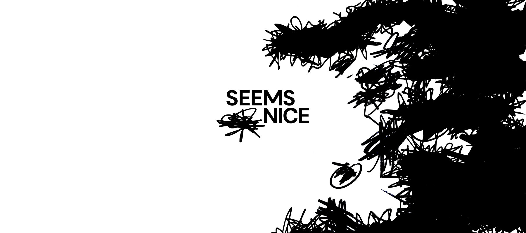
A name that pretends to be polite. A logo that says otherwise: a black scribble strikes out a word and “NICE” takes its place, irony in one gesture.
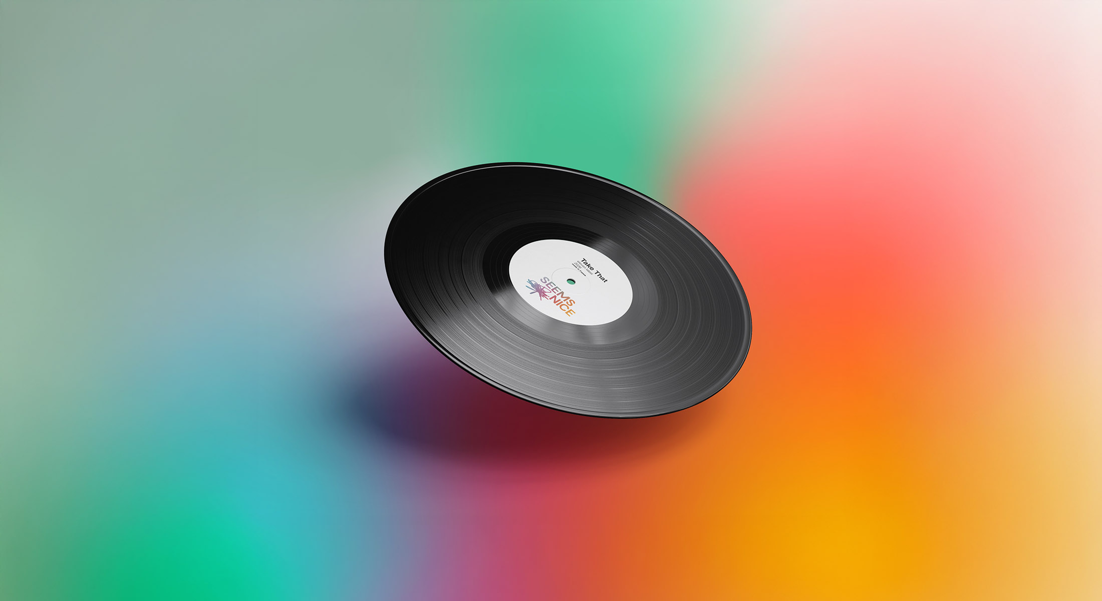
The world around it stays loud and sugary. Acid gradients melt from mint to blood orange. Fisheye shots push fingers, cans and sneakers straight into your face, shot on concrete, benches and fences. Sweet on the surface, street underneath.
Identité visuelle — Seems Nice
Conception de l’identité graphique pour l’artiste Seems Nice. Le design traduit l’ironie entre son nom et son univers musical en opposant une typographie minimaliste à une rature dynamique. Ce geste énergique simule l’effacement d’un mot négatif au profit de « Nice », incarnant une musique brute et contrastée.